
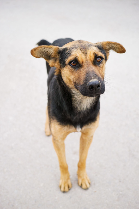
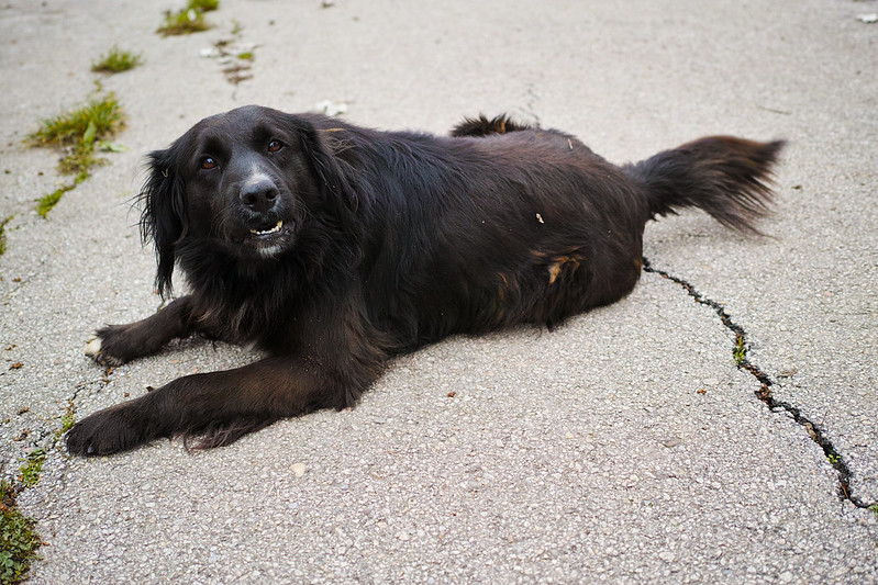
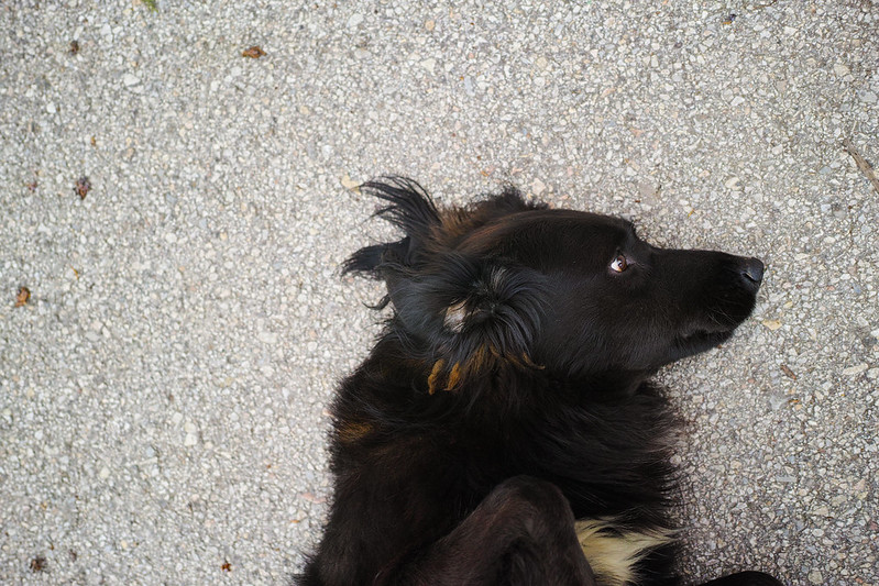
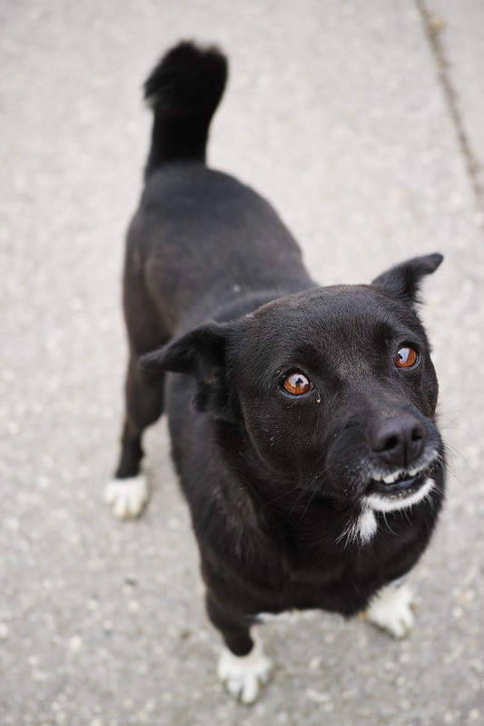
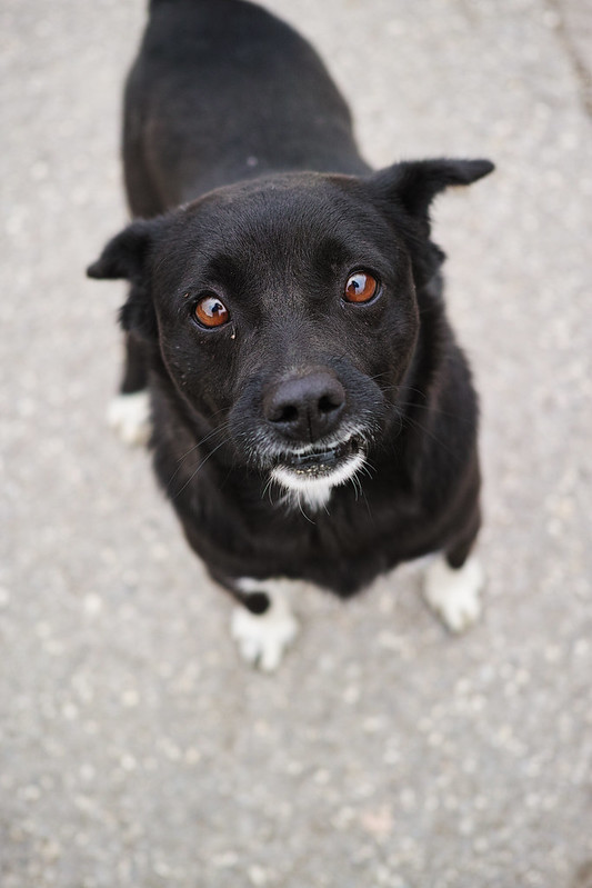
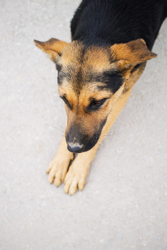
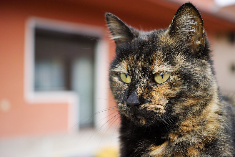
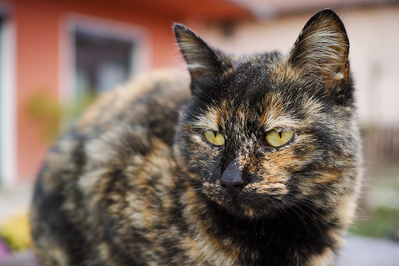
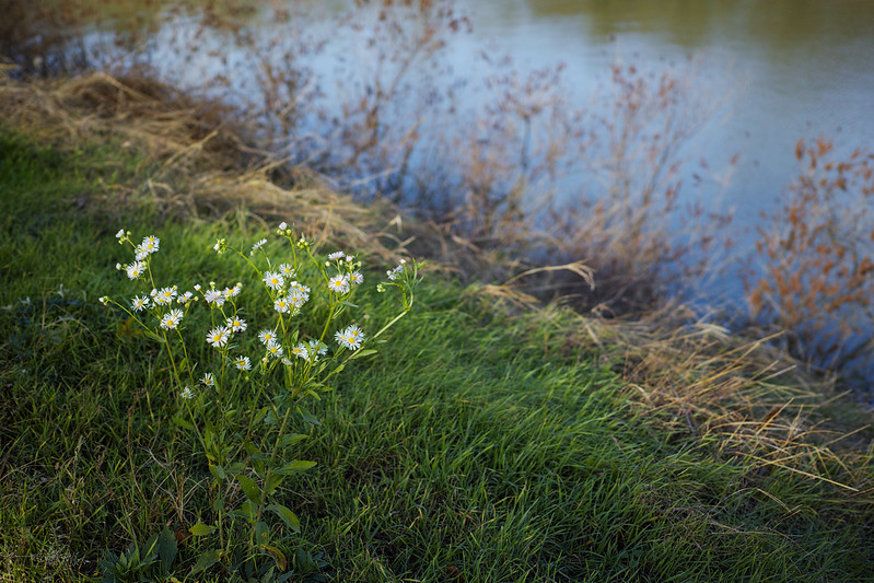
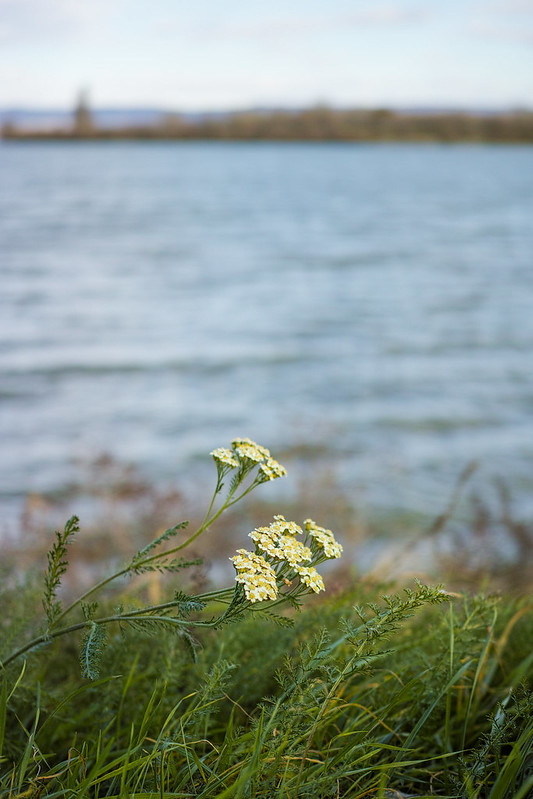
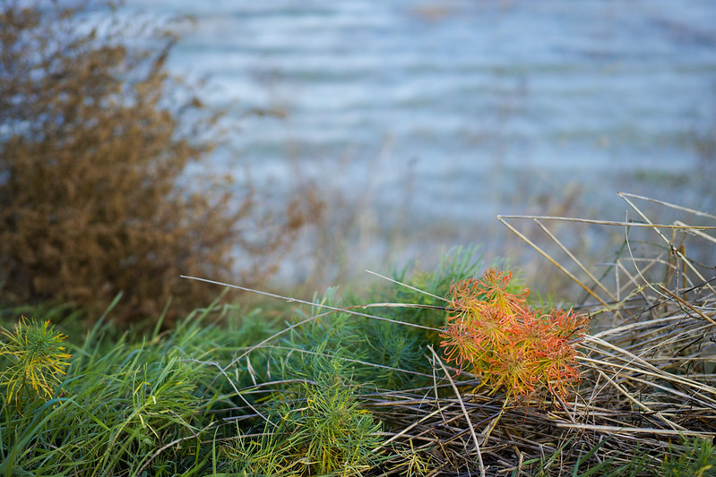
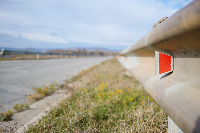
Once again, I was out taking pictures with the Quattro – this time in very soft and flat light. On the whole, I am happy with the results. Slowly, it dawns on me how exactly I need to edit pictures taken under a cloudy sky. For me, the difficulty so far was to correctly adjust white balance and saturation in order to make colors appear lively but still realistic. In the past, I often made the mistake of adding or leaving in a little yellowness, as if it were pictures taken on a sunny day in the shade. Sometimes, I didn’t nail it at all to remove the tint with the infamous color ball in SPP 5. With SPP 6 and the color square this works out far better. 😉 The rest – saturation, hue and color luminance – I edit in Lightroom, after having exported the photos as 16 bit TIFFs from SPP. Besides orange and yellow, as outlined here, I meanwhile also experiment with green and blue. I pull the sliders till I’m happy with the result.
What I still need to learn, however, is how to control noise despite high contrast enhancement and tonal value editing.
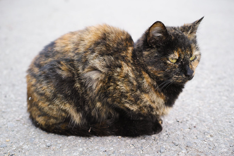
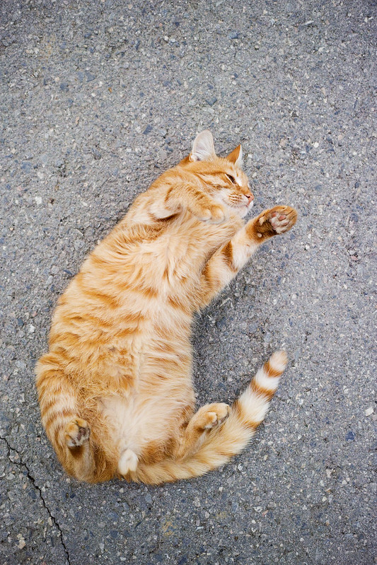
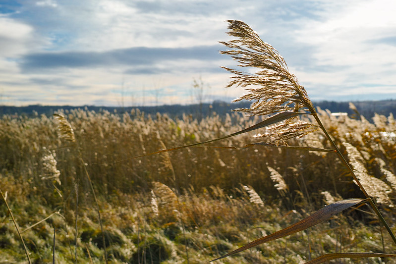
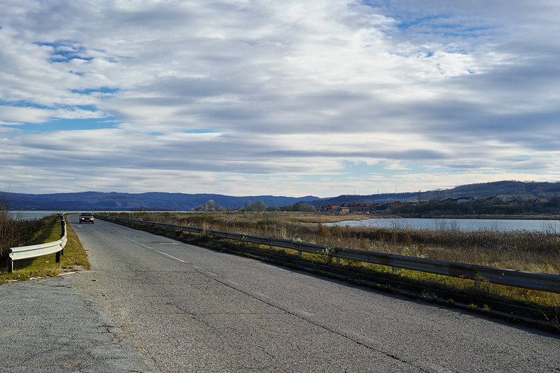
You can find more of my DP2Q shots on Pinterest and Flickr.

Processing looks quite good. Unfortunately Sigma decided too create a camera more unattractive than the Pentax ‘Brick’ K-01 !!! Sigma, how about a Epson RD1 type body with your sensor. Merrill color output was a few steps backwards from my DP2S. Quattro looks better for sure and one now has very usable jpeg output. Bravo! Now please produce good looking body.
Thanks Hunter!
I’m one of the people who likes the design, but not so much the size of the camera. A notch smaller would be perfect for me.
That is highly unlikely, considering that Sigma would need to design a new lineup of lenses, which would be incompatible with all other systems, due to short flange distance.
I agree. Quattro color output is much better than Merrill.
Better looking or more ergonomical body? Looks are not important, if you ask me.